

12 tips on making the customers buy more in online
The e-commerce industry is probably one of the most competitive at this moment, globally. Therefore, having a successful online shop is not an easy task at all, let alone always growing your business and your customers’ base. There are, although, some steps that, if followed, can really help you achieve your goal.
- Context MattersYour call to action has to fit in with the rest of the copy you have on the page. In this case, put a shopping-cart-related call to action on a page that talks up the product you’ve created or in an article talking about how your product solves a particular problem. It would not go well in an opinion piece about news within your niche.
- Keep it Simple
Your consumer need to find the right information fast. Don’t overcrowd the message by having a heavy environment or many information popping out. It’s important to make the consumer journey as fast and easy as possible. Nothing forced, just flowing. Guide him without letting him feel he is guided. The body of your copy is the place to talk up your products or services. The call to action is what convinces consumers to start shopping.
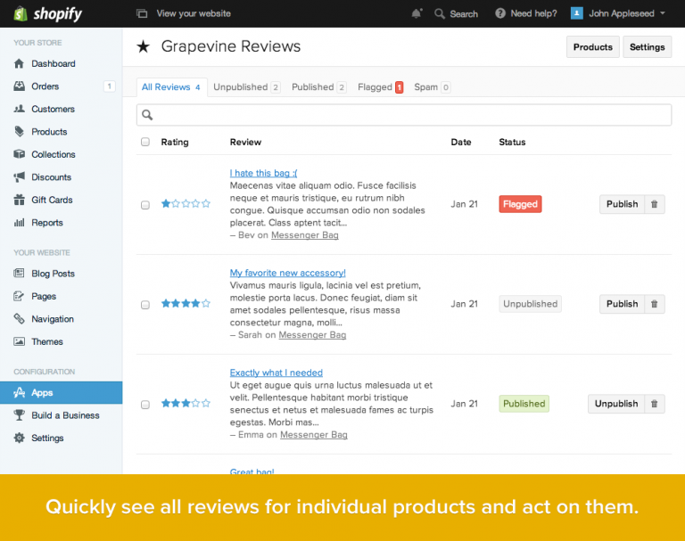
- Product reviews
Sometimes the best advocate for your online shop and product are your customers. Your product descriptions – something we’ll cover late – can only do so much to convince folks to part with their money. Allowing your customers to review products they’ve bought lets them express how they felt about the overall experience and the product itself. Plus it’s the perfect way to get your products validated by a third party. According to Reevoo, quoted by Paymill.com, “reviews produce an average 18% increase in sales, and having 50 or more reviews on a product can increase its conversion by 4.6%”, while MarketingSherpa considers that 58% of consumers prefer sites that offer reviews.
- Placement Matters
Most of the time, a call to action works best when placed at the end of your copy or content. If your particular business makes use of the long-form sales page, putting the call to action higher up is a good idea. You can highlight the benefits of your products and encourage people to buy.
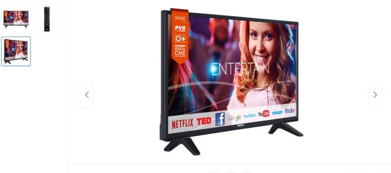
- Make sure you use quality images
Since the technology has evolved so far and one can take a great quality picture, at a high resolution, even with the smartphone there are no more excuses for not using the best pictures possible for your products. You can not only use images to highlight your product’s qualities, but also show it in use to help visitors visualize how the product can be used everyday.
- Great product descriptions
Making it easy for the customers to find the right information and teaching them about the product they are interested in. The writing should be focused on you target and its needs, therefore the tone of voice should be adapted to that. It’s important to focus on the product’s benefits and to keep the language simple, avoiding as much as possible the jargon and write short sentences to help the readability.
- Build Excitement
You need to build up the product or line of products in customers’ minds before asking them to buy. This way, there won’t be any doubt about if they want to take the action you’re calling on them to take. Talk about or show how beneficial what you’re selling can be in the buyer’s life.
- Be Active, Not Passive
“It would be nice if you bought my stuff” is not the same as “Click here to start shopping.” Passive implies that you aren’t sure if you want them to do the thing you’re asking them to do. Active voice removes all doubt about your expectations, shows confidence in your products and brands, which it will bring confidence for the customers as well.
9. Try and have pages as clickable as possible
It helps if you make your call to action an actual clickable link — preferably to your shopping cart (which can say something like “Cart empty! Start shopping here”). This saves the viewer the time of searching for the thing that helps them do what you want them to do. As said earlier, making things easier and comfortable for the shopper only helps your business and your sales.
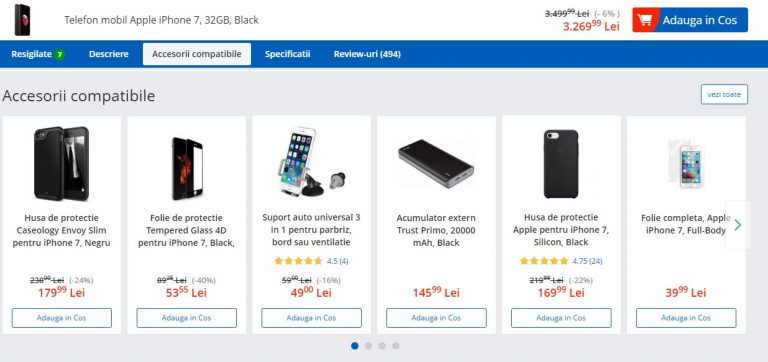
- Show related products that would look great next to the product they already have in the cart or that would fit perfectly. For example for a photo camera a memory card or different lenses. People tend to buy more this way. It’s an opportunity to increase revenue because it shows items visitors may not have otherwise been looking for and it takes them to pages they may haven’t been interested in entering.
- Easy and safe payment
One of the biggest concerns that people address when it comes to online shopping is the safety of their payment. Make sure you have a trustful provider and that you make the process as easy as possible. Offer them different payment methods, don’t force them to sign up for different offers or newsletters, don’t ask them a bunch of unnecessary information, make sure the checkout page matches the rest of the store. Those would be just some easy, but really important pieces of advice.
- Test, Change, Test Again
Having an online store means constant work of improvement. Even if you have constant growth and awards won, there is always something you can improve. Therefore, test and keep on always testing your website. After all, the final goal is to always keep the costumer happy and wanting to come back and bring more friends along.
Best packaging ideas for 2017
In the very competitive and full of inspiration and imagination year such as 2017, a good product is not enough for it to become a brand and capture the consumer’s attention. Let alone make him/ her choose it from the numerous similar products on the shelf and lead to a future buy. Therefore, a great packaging design, in sink with the product’s qualities, characteristics and what it stands for, will mark the path to a successful rise and growth of a brand.
Here are some of this year’s main packaging design trends and ideas:
1. Back to basics. Simple, bold and clear
source: skinn.be
This year, the trend is better articulated and more compelling to the customer. Minimizing the elements used in a package design can elevate a product… as long as it gets the point across. In our fast-paced world, shoppers don’t always have the time to study each and every product detail. Sticking to the essentials and making sure the buyer will make a more informed decision, a clean-cut design can convey information and make a product shine using simplicity.
According to thedieline.com, the designers understood the purpose of the object and the thought process of their audience. In service of this, they simplified the message and stated it clearly and boldly across the face of the packaging. These designs are text-based and say what they are in no uncertain terms. They realize the value of a simple message in today’s crowded world. The simplicity does not come off as lazy or incomplete but refreshing and honest. This is the manifestation of the idea: clarify not simplify. These designs identified exactly what the customer was searching for and expressed it simply. It comes off as powerful and trustworthy.
source: tapped
2. Putting focus on the custom lettering
Almost every designer loves to get crafty and create some of their artwork by hand. According to Martin Lupus of 99designs.com this thing happens in order to get the organic effect: fluid imperfections—like irregular lines or natural texture fills— that can make a product stand out through warmth and set it apart from digital designs. “This warmth can create an emotional tie to the product, making it feel handmade and wholesome, or communicating a feeling of nostalgia. Either way, for 2017, we are seeing a massive comeback of hand-lettering,” added Lupus.
source: sweetyland
3. Letting geometry rule!
source: thedieline
Hand in hand with the previous trend, this theme is centered around expressing simplicity, approachability, and honesty through patterns and shapes. Circles, triangles, and squares are, as the specialists consider, an attempt to treat the mindset of a weary, overwhelmed consumer. Particularly in industries with over-the-top design, these reduced approaches standout. Familiar shapes, colors, and patterns communicate an awareness of the world and a sensitivity to the consumer.
- Old school with a twist
The past is haunting us, but in a good way, through a “idealization of the past—a longing for simpler times when things were cared for, made by hand, and detail-oriented”, as Grant Wenzlau from dieline.com would say. But these designs are not simply regurgitating old forms and techniques, they are modernizing them and combining them in new ways. “This new take on what is old is refreshing because it selects the best parts of different periods of our history and juxtaposes them. These designers realize the increasing rareness of endangered techniques like calligraphy, letterpress, and foiling. These artisanal practices grow more and more desired each year. In the mind of the consumer, they are increasingly novel and related to greater value. But far from merely being historical, these techniques are being re-imagined in the context of mid-century layouts and applied to a 21st Century, cutting-edge materials”.
source: ACH Vegan Chocolate
source: cocktail kit
Moreover, vintage package design brings back memories for people who lived through the original era and satisfies the curiosity of younger generations eager to explore the past. The key to going vintage is to find a balance.
5. Making the color a focus and priority
Colors evoke emotions and affect purchasing decisions. Because of this, color has always been one of the most important choices in packaging design, presenting in new, exciting ways. Bright colors and vibrant associations are beginning to make a scene on store shelves. More than that the colors and their special use are able to differentiate the packaging and the product at the shelf, making it to stand out and attract the consumer that will always choose exciting over common and boring. Also, it is proven that the consumer will always remember a product that is interesting and has the wow visual factor.
source: Pyramida
source: Resonance
6. Be playful and multi-functional!
In each of us lays a child and we love to be given the opportunity to loose ourselves from time to time. So does the consumer. He appreciates a good, interesting packaging that can be joyful, playful and multi-functional.
source: Monstea
7. Repeating a pattern
source: Helmes Workshop
We learn and remember through patterns, as our brain is built that way. Using well-chosen and beautiful patterns can also elevate a package design from ordinary to ethereal. Although the idea of repetitive shapes might seem simple, the technique can be dynamic and compelling when used correctly. Moreover, as it happens in writing a book or a play or a song, repeating a visual motif that captures the essence of the brand sends a strong message. Whether the pattern is bold or playful, patterning the package can create a strong identity that customers will always remember.
8. Storytelling & narrative
source: Smith & We All Need Works
People love stories and, as previously said, having a story behind everything one does it’s always a plus, giving it authenticity and creativity, at the same time. We seek out and cherish the stories that feel closest to our hearts, therefore the packaging design are starting also to incorporate narrative illustrations, trying to get closer to the consumer’s empathies and emotions. The place where the real sale and conviction start.
9. Putting it in the mail
source: Luxembourg
Internationally, there’s a strong comeback for the print and its values, for going to back to the roots, the life before the online. Coffee shops that are inviting their costumers to stop using the wifi and talk to each other, online magazines that are starting to get their first printed versions, people choosing books over kindles, etc. With faster, more efficient ways to communicate, the joy of receiving a letter via the post, in the real mail, not online, has started to disappear over the years. But there is a new trend that will take people back to that feeling. According to the specialists from 99designs.com, the packaging design is here to save the day with an emerging postal trend.
10. Going eco-friendly
The years to come will be more and more about sustainability. According to packaginginnovation.com, the new trends are about using green padding materials, with biodegradable bubble wrap and recycled paper being perfect eco-friendly alternatives. “One of the leaders in sustainable design, method sells bottles made with recycled ocean plastic. From using more renewable resources to keeping materials recyclable, more consumer brands are integrating eco-friendly design into their business. This is a trend that we hope to see grow with each year because it benefits everyone,” also added and concluded Martin Lupus.
source: Grow With Me