26 User Experience (UX) Design Stats for Digital Success
What is User Experience (UX) Design for Digital Success?
User Experience (UX) Design improves customer satisfaction and loyalty through the utility, ease of use, and pleasure provided in the interaction with a digital product (mobile app, website etc).
We interact with digital products a dozen times every day. From checking social media to ordering food and texting our loved ones. According to AppAnnie, the average smartphone user has more than 80 apps on their phone and uses close to 40 of them each month. If they weren’t easy to use, they wouldn’t be on your smartphone!
To help you understand how vital UX Design is to every website owner or admin and essential to every entrepreneur and business owner, I’ve put together the following list of 26 stats.
26 User Experience (UX) Design Stats for Digital Success
1. 70% of people scroll your content; only 20% scroll to the bottom.
Put your best content first.
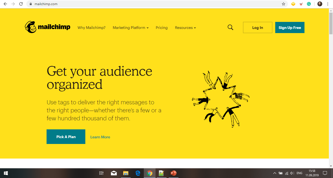
2. Users spend 80% of their time above the fold.
Make the content above the fold engaging, eye-catching and tell them what your product or service is all about in as few words as possible. Make it concise and to the point.
3. 74% of users only see the first two screens.
Make sure the first two screens include relevant content to your website visitors.
4. It takes 0.05 seconds to form a design opinion.
That’s fast! Will your users like what they see?
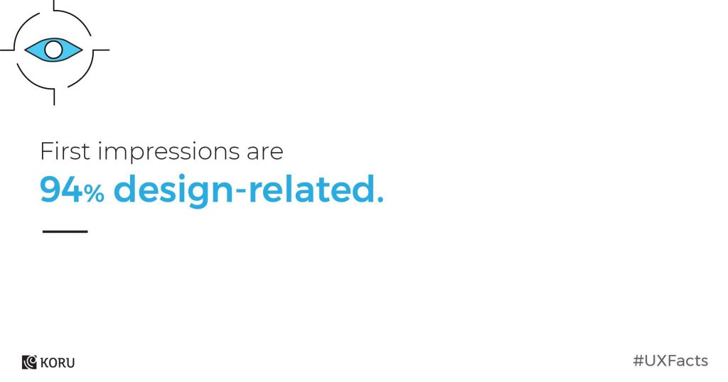
5. First impressions are 94% design-related.
As in life, you need to make a great first impression and a good design helps you achieve that.
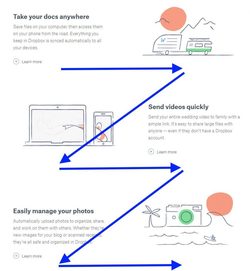
6. 75% of users scan your content instead of reading word for word.
Yes, it took you three hours to craft your latest in-depth long-form blog post and your readers won’t read it, they will scan it. It’s true what they say: writers don’t get the appreciation they deserve. It’s sad, but there’s a solution: use sub-headlines, bullet points, lists, paragraphs etc to help your readers understand quickly what your blog post is about.
Source: uxplanet.org
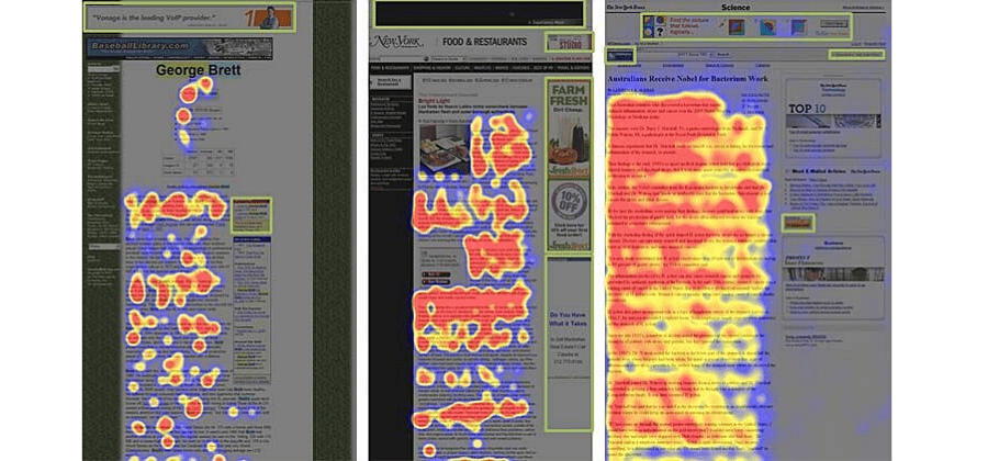
7. Users avoid looking at adverts based on their location: right-hand margin and top banner.
It’s called ad blindness and is the result of the digital ads proliferation that happened in the late 1990s. As a measure of self-protection, our brains learned to ignore these ads or any content placed in the right-hand margin and top banner. Don’t place important content there!
8. Find out how people use your product or service in the real world.
The first rule of marketing is you are not the customer. Go out and meet with your customers. Speak to them and see how they use your product in the real world.
Here are the top 5 user testing methods as recommended by Adobe:
- Usability testing where UX designers understand how real users experience your website or app.
- Focus groups help them assess user needs and feelings both before a product’s design and long after its release.
- Beta testing allows UX designer to roll out a near-complete product to individuals who are happy to try it and provide critical feedback.
- A/B testing is ideal as the appropriate testing method when designers are struggling to choose between two competing elements.
9. What is the user experience? What people feel, want, think, believe, remember, don’t realize about your product.
UX designers are critiques, artists, psychologists, behaviour analysts and architects. They think in the past, present and future.
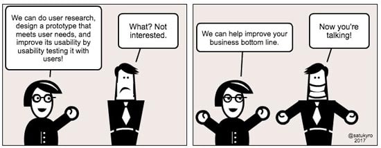
10. Great user experience design can boost your brand, customer satisfaction and your company’s bottom line.
11. Above all else, user experience is about listening.
Listening is an underrated UX design tool. The goal of every UX designer is to understand the user’s needs and understand what they want. They can achieve their goal by having empathy towards users and listening is the way towards empathy.
Having the ability to step in the user’s shoes is considered a must-have skill for UX designers. It is one thing to hear the user’s problems, it is another thing to listen to the user’s problems.
Why should UX designers listen to the users? The main benefit of actively listening to the user is that UX designers have an easier time designing solutions because they know exactly what they are designing.
12. In case of confusion, sketch it out.
In case of confusion, #SKETCH IT OUT. Has sketching helped your #design process? Share with us in the comments below.#SketchThis #drawing #illustration #draw #ux #ui #uidesign #userinterface #architecture pic.twitter.com/PEEHlnmmtF
— Koru UX Design (@koru_ux) August 29, 2019
13. “You make people happier not by giving them more options but by stripping away as many as you can.” — Cliff Kuang, Wired
One would argue that having many options to choose from leads to the best decision. Actually the opposite is true. It’s called decision paralysis.
Analysis paralysis is a state of over-analyzing (or over-thinking) a situation so that a decision or action is never taken, in effect paralyzing the outcome.
Hick’s law describes the time it takes for a person to make a decision as a result of the possible choices he or she has: increasing the number of choices will increase the decision time logarithmically.

Source: boagworld.com
14. Have your website recognize holidays and special events.
Why? The first reason for a website to change its design for a holiday or special occasion is to appear up to date.
A website that doesn’t reflect what’s currently topical and important will feel out of touch. Worse, it will seem stale and people may think that it is outdated in other respects as well.
The second reason for a website to show holiday decorations is to increase visitors’ joy of use. (NNGroup.com)
15. Great products do less but better.
Fabricio Teixeira, Design Director at Work & Co and Founder of UX Collective on Medium talks about the dangerous allure of adding more features to your product.
In their attempt to bring more happiness to the users, UX designers often turn the product into a Jack of all trades, doing so many different things that its value proposition starts to dilute.
Adding new features to the product is a common way of buying short-term, artificial happiness.
16. Get a UX writer on your team for great microcopy
UX writing is not a trend, but a new discipline. UX writers turn blocks of text into microcopy – a plain, concise and easy-to-understand copy.
A good microcopy helps users get to the next step in their buying journey. It shows care and understanding about their feelings at every step of the user flow.
UX writers create the right microcopy that can influence business profits.
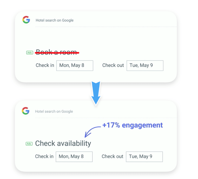
When Google changed Book a room to Check availability, the user engagement increased by 17%.
Source: medium.com
17. 1 in 3 people will abandon a purchase because they can’t find the right information.
Make it easy for your buyers to get to the final click on your purchasing process.
Don’t add extra steps and don’t make it harder for them to find information.
18. ‘Enlarging a screen to click’ is the most frustrating mobile shopping problem.
Optimise your website for mobile display. Avoid frustrating your users with unnecessary actions.
On mobile, buyers expect brands to offer them a smooth experience.
19. 39% of people will stop engaging with a website if images won’t load or take too long.
No one has the time or patience to wait for your website images to load.
It shows a lack of interest in your users’ needs and a negative experience will prevent your users to visit your website ever again.
20. 65% of website visitors wouldn’t submit a form if too much personal information is required.
How much personal information do you actually need from your users? In this day and age, with major corporations selling our personal information to third-party platforms, sharing personal information is a very sensitive subject.
Ask your users for the most basic information while on-site and find other ways (like the mail) to complete their profile with personal details.
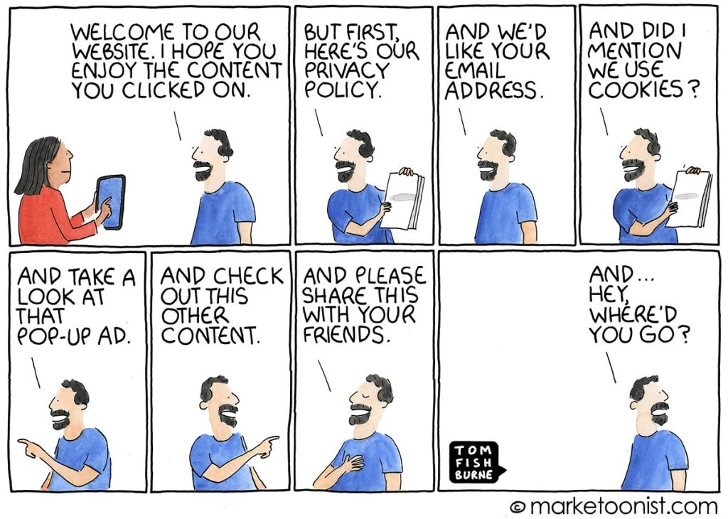
21. Visit-to-lead conversions can be 400% higher on sites with a “superior user experience”.
Source: marketoonist.com
22. 97% of business customers cite ‘ease of use’ as the most important quality for mobile apps.
What does ease of use mean when it comes to mobile apps?
It means helping your users achieve their goal in the most effective and efficient way possible.
Delete redundant steps and make your mobile app frictionless.
23. You only need to test with 5 users.
Contrary to the common belief, it takes only 5 users to test your website or mobile app.
As you add more and more users past five, you learn less and less because you will keep seeing the same things again and again.
After the fifth user, you are wasting your time by observing the same findings repeatedly but not learning much new.
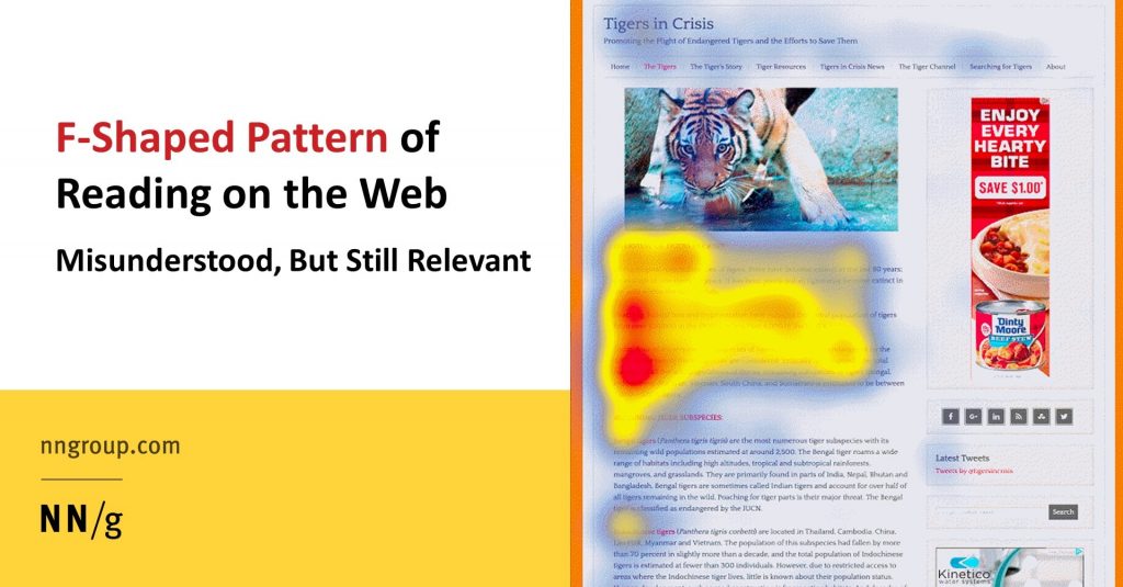
24. The F-shape scanning pattern is bad for businesses. Good design can prevent F-shape scanning.
The Nielson Norman Group (NN/g), pioneers of the research-based user experience identified the F-shaped reading pattern for web content in 2006.
What exactly is the F-shape pattern?
It’s users reading the first lines of web content text and the first few words on the left of each line of text.
Source: nngroup.com
25. UX in motion keeps the user engaged: a new, easy and great way of presenting your product.
Are you looking to keep your users engaged?
Use UX in motion to present your product.
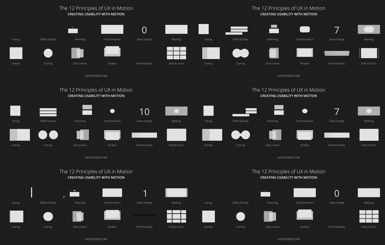
Source: uxinmotion.com
26. Make your UX design aesthetically pleasing.
Always remember that attractive design is more likely to be used and loved.
Join the Conversation
We’d love to hear what you have to say.
Get in touch with us on Facebook Group and Twitter.
Technologies that help you work from anywhere in the world
Fifty-one percent of EMEA teleworkers work from home just one day or less, with 68 percent in APAC and 58 percent in North America reporting the same.
According to a Global Workplace Analytics survey, Cost and Benefits: Advantages of Telecommuting for Companies, nearly six out of ten employers identify cost savings as a significant benefit to having telecommuting programs. Real estate costs alone can make up the majority of a business’s annual overhead costs. The average real estate savings if a business employed full-time teleworkers? $10,000 per employee per year; add in reduction of utility costs and that number increases to $11,000, or $700 billion per year in the U.S. if employees worked from home just part-time.
But more than that, more and more people decide to work out-of-home while travelling and experiencing other activities, by becoming digital nomads or simply working remotely for a longer period of time. Their new lifestyle is helped and allowed by the new technologies available. Some of them are:
Videoconferencing
Live video feeds help out-of-office workers see and speak to one another in real time, anywhere they are, which is the next best thing to a face-to-face meeting. And that being possible due to the fast internet broadband available in may places around the world, the increased number of places offering free wifi. Moreover, “certain companies have even done away with renting a traditional office and instead run their business out of a shared co-working space to accommodate their largely remote workforce. Shared office spaces, where remote employees can gather to work, have been created and are more widely available in different cities. This in itself represents the growing amount of remote workers in recent years,” wrote BusinessNewsDaily.com.

Collaborative cloud software
Investing in them (you can find some inspiration here) , especially in the ones that work very well on mobile, will help improve the response and the remote work. Building a digital workplace gives your employees the tools they need to collaborate and work from anywhere, anytime and on any device and that’s the key to building productive modern teams that deliver business results.
Adapt to change faster and achieve objectives sooner with project management solutions, by bringing together work management, full reporting, visibility and an intuitive interface that anyone can use. Cloud-based project management software gives your workforce, customers and partners a better way to work together using real-time data, automated workflows and a user experience that lets them do their job the way they want to.
The best devices
From a good, thin and powerful laptop or notebook, to a smartphone, a power bank and an external hard-disk, those devices are probably the most important ones you will need to carry on with you almost all the time. “For long-term remote work, purchasing the latest laptop model is smart, as technical difficulties can be crippling when there’s limited access to an in-house IT specialist or nearby Apple Store,” advices mashable.com.
Moreover, “an international SIM card is more expensive, but potentially worth it if you’ll be traveling to multiple countries in a shorter time period. ChatSim, which supports all of your chat apps so you can stay connected from anywhere, is another alternative if you’re only interested in sending texts or instant messages. Carrying a separate global, unlocked MiFi device ensures a backup plan in the event of a weak Wi-Fi signal or public networks of questionable security. Other useful tools include: portable travel routers, Ethernet cables, and Google Voice, which is especially handy for keeping a U.S. phone number (NomadSMS is another similar service),”points out Stephanie Walden for mashable.
Privacy filters for laptops
Screen privacy filters are an easy way to keep snooping eyes from seeing what’s on your laptop monitor.
Moreover, here are some tools that can help you manage your business from anywhere in the world.
Gmail versus Outlook: which e-mail provider is better for you? Part I
According to a Radicati Group study from January 2017, there will be more than 3.7 billion email users worldwide by the end of the year. That means that nearly 54% of the entire planet is currently using email. Putting things in perspective, the same group reported about 1.9 billion worldwide users in May of 2009 and projects that that number will reach 4.1 billion by 2021.
According to wikipedia, Gmail dates from 2004, but Official Gmail Blog tracks the public history of Gmail from July 2007. In February 2016, Gmail reporter 1 billion monthly active users, up from 900 million the company announced during its I/O developer conference in May 2015 and up from 425 million in 2012, says TechCrunch. Outlook was re-launched by Microsoft in 2012 Microsoft migrated all Hotmail users to Outlook.com. The fledgling service has a ton of unique features including Clutter, email rules, and integration with Outlook calendar. In early 2017, Outlook.com had a reported 400 million users. However, that number hasn’t changed as drastically as Gmail’s statistics. In July 2011, Microsoft was said to reach 360 million active users for its Windows Live Hotmail service worldwide.
The Radicati Group counts the 3.7 billion email users in January 2017 as both consumer and corporate users. However, because it isn’t clear how the email accounts are differentiated between consumer and business users, it’s hard to measure the accuracy of the statistic.
Therefore, we decided to take a look at the most important two email providers: Gmail and Outlook, and give you the possibility to have a clearer picture on which one you would prefer better. Both Gmail and Outlook offer both free and premium versions. The premium email versions have, naturally, more features.
| Google’s Gmail | Microsoft Outlook.com | |
| Storage | 15 GB. The storage limit is shared between Google Drive, Gmail, and Google Photos. If you’ve reached your limit you can buy extra storage. Your Google Account also has storage in the cloud-based Google Drive. | While the actual limit is unclear, it appears that you start with 5 GB of storage and this amount increases over time. Your Microsoft Account also has storage in the cloud-based OneDrive. |
| Search Capabilities
|
Search any combination of the following elements using the advanced search:
|
Outlook.com has a simpler search. The search mail or people option allows you to search any combination of:
Or you can search your contact list. There is a separate search for Skype as well.
|
| Security | Includes 2-Step Verification and spam detection. You can enable a verification icon for emails from verified senders through Google Labs. | Includes 2-Step Verification. Uses trusted sender icons for emails from trusted senders. Suspected spam messages appear with colored red or yellow safety bars at the top of the message. |
| Inbox Organization
|
Default Gmail organization is based on labels and up to five tabs. Assign colors to labels and use stars and other symbols to flag important messages. Also, you can convert your inbox to a classic inbox or a priority inbox. | Default Outlook organization is based on categories, folders and subfolders. Flag important messages or pin them to the top of the folder. |
| Instant Messaging | Gmail uses the Chat function for instant messaging. You can find the Chat icon towards the bottom of the Gmail inbox on the left. | Outlook uses Skype for instant messaging. You can find the Skype icon in the upper right corner of your inbox. |
| Contact Management | Import contacts from a variety of other email providers including:
Import a CSV or vCard file. Import contacts from your Google+ social media account. |
Import contacts from other sources, including:
|
| Advertisements | Ads appear as emails at the top of your inbox tab. The word “Ad” appears in a yellow box to the left of the subject line. | Outlook.com uses display ads that appear to the right of your inbox. They take up quite a bit of space on the screen. |
| Extras | Incorporates tasks, customizable themes, Google Lab. | Incorporates calendar, tasks, customizable themes. |
source: Business Tuts Plus
Head to head
Calendar
As process.st points put, neither platform has a real solution that lets you view your calendar and email side-by-side. While both Gmail and Outlook sync events with your calendar, neither let you view your calendar and inbox at the same time, in one tab. When you click on the Outlook tool bar, you’re taken to a separate calendar window. On the other hand, when you click on Calendar in Gmail, it keeps your inbox open, and adds a new window (or tab) with your calendar.
Neither Gmail nor Outlook lend well to multi-window viewing. At least Gmail lets you view your calendar and email at the same time.
User Experience (UX)
Text in Gmail is larger than in Outlook. Coupled with the clear definition between bold and non-bold text, as well as the inbox shading available with most templates, Gmail is generally softer on your eyes. So if you are spending a lot of time in front of the computer, you might prefer Gmail on this one. Moreover, the provider is very useful when it comes to unread emails. “Read” emails appear in a darker shade than “unread” ones. “Unread” emails are also distinguished, because their sender and subject are in bold.
Outlook differentiates these by putting the sender and subject in blue. It’s bold too, but since the text overall in Outlook is flatter and smaller, you still need to squint to see if something is a new email. More opinions you can find here.
Filters & Organisation
Besides the already known features, lifehacker.com, points out that Gmail uses labels and stars instead of folders (although it has faux-folders, too.) You can apply multiple labels to your messages, which gives you greater flexibility in setting up exactly the kind of organization scheme you like, and stars let you set aside the most important emails for later. You can even enable Smart Labels that Google can apply labels like Finance and Travel automatically.
Gmail also uses a priority inbox system to automatically find messages it believes are important to you. Emails are deemed “important” based on who you email, which messages you open, what you interact with and other criteria. You can also manually mark an email as important to help it learn.

End of part I.
