What does emotion look like on a phone?
It’s no secret that the excitement men experience when they get their hands on a new gadget is different to that of a woman. The attitude is divided, with one side focusing its attention on the technical details and the other more on aesthetical features.
Motorola is taking the best of both worlds, aiming to deliver next-gen devices that will meet customer needs.
Recently, this effort has been complemented by the partnership with Pantone Color Institute™. Motorola seeks to deliver creative and inspiring products to its customers that will create a strong emotional connection with past and future experiences of users, as well as being at the forefront of technology, implementing state-of-the-art technologies and features.
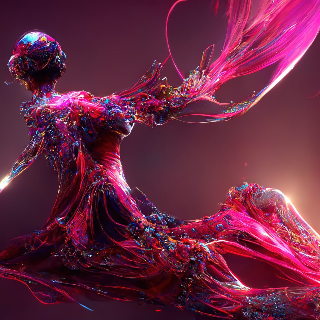
Forward-thinking
Motorola is putting a lot of attention into technical details and elements that can provide a better consumer experience, but product design engineers felt that there was an element missing.
Questions such as: “How can we quantify emotions using colours?” and ”How could we offer our customers the best product experience?” have been answered through Pantone’s 55 years of experience.
“By combining our consumer and innovation-focused technology leadership with Pantone’s expertise in colour trending, forecasting and market research, we will provide our consumers with another valuable method to express themselves through our devices.”
Ruben Castano, Motorola Executive Director of Customer Experience, discussing the partnership between Motorola and Pantone Color Institute™
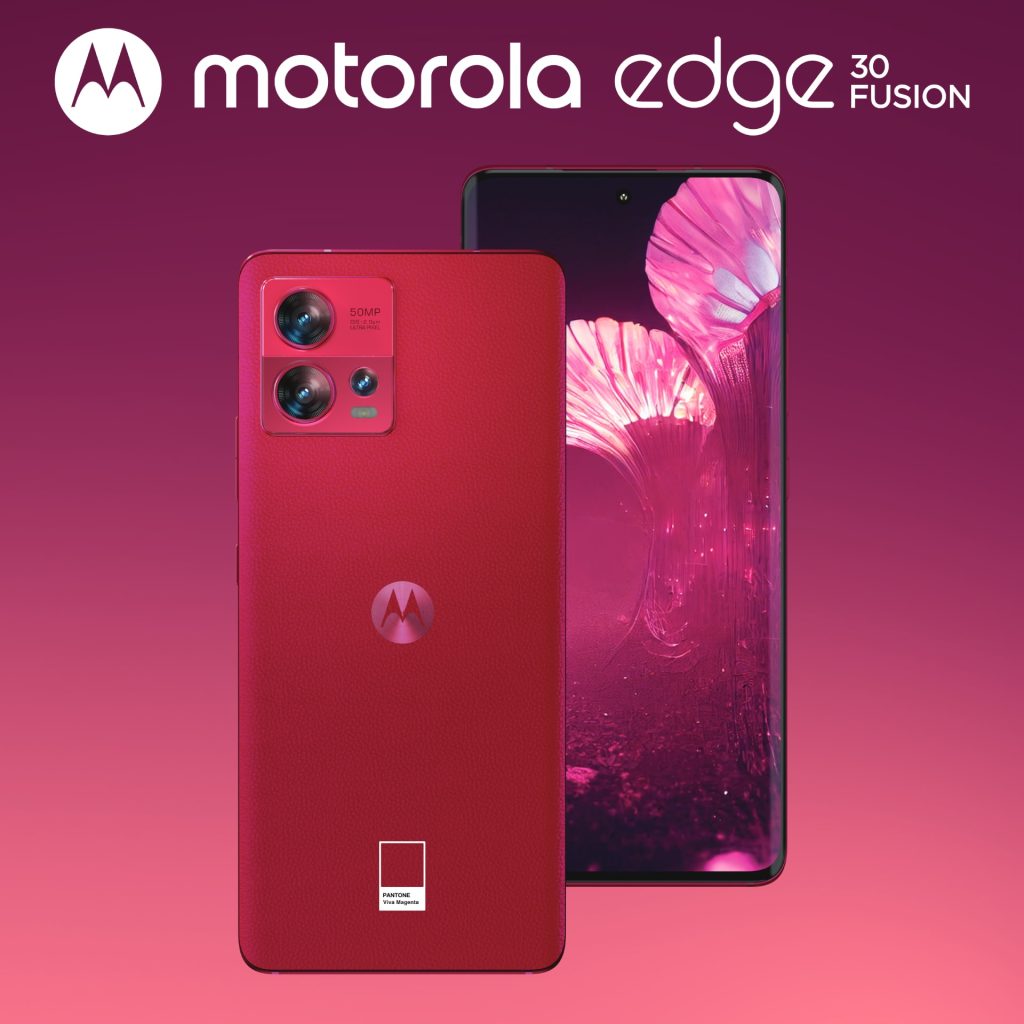
First results in terms of colours
The Very Peri shade has been designated “Color of the year 2022” and was featured on Motorola Edge 30 Neo. It is a colour with carefree confidence and a novel presence that inspires dreamers and empowers creators. It is complex yet has mass appeal. It is the most appropriate colour to dissolve the lines and forge bonds between generations, genders, and cultures in a new decentralized world.
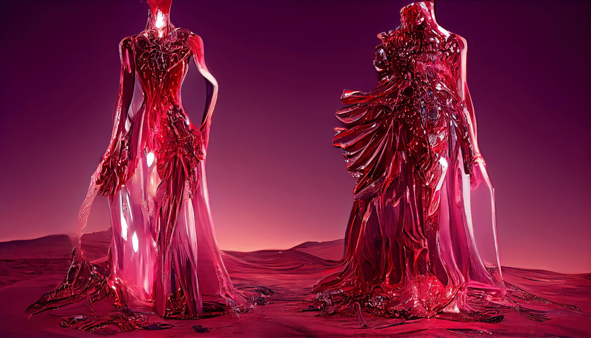
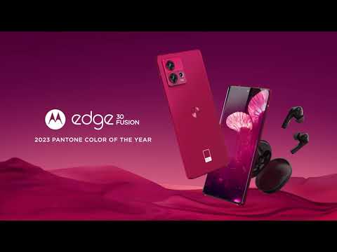
The 2023 colour of the year Viva Magenta is featured on the Motorola Edge 30 Fusion. This is the merging of the virtual and the physical. With strong notes of red, Viva Magenta is inspired by nature and technology, revealing multiple dimensions. Viva Magenta highlights how consumers are using electronics to enhance their personalities and to better express themselves, a sentiment that is perfectly aligned with the ethos of Motorola.
Motorola designers will be working closely with the Pantone Color Institute™ as they continue to develop the partnership and incorporate colour psychology and strategy into its upcoming portfolio.
