

Debunking 3 UX writing myths and how UX writing improves the product experience
In this article, UX writer Cindy Suryautama Sukiato debunks 3 UX writing myths and provides examples that illustrate how UX writing improves the product experience.
When I first started writing this article, I wanted it to provide practical insights that are directly applicable to enhancing products. Sounds like a good plan. Besides, there are already great articles out there that elaborate on what is UX writing, and here’s my favourite version that I often use to describe what I do:
User experience (UX) writing refers to the words you see or hear in a product when you’re using it. For the most part, these words are unobtrusive, and you might not even notice them.
Andrea Drugay (UX Writing Manager at Dropbox)
Quite a straightforward and clear cut definition. However, to truly benefit from UX writing, knowing what it’s not is as important as knowing what it is.
Well Known = Well Understood?
Nowadays, a search on LinkedIn will show that more and more companies are steadily hiring UX writers.
While the heightened awareness is surely good news, I’ve noticed that there are a few misconceptions around the field. Thus, I decided to dive right in.
Debunking 3 UX writing myths
#Myth 1: UX writing is the same as copywriting
Truth be told, there are divided views about this.
Both share similarities in which before even writing, you’d invest a good deal of time to first understand your target audience.
The big difference is in the writing intention.
Copywriting has the main purpose of attracting users, emphasizing on the benefit of your product and how it can make the users’ life better.
UX writing, on the other hand, comes into the game once people start to use your product (for example, after users installed your app and opened it for the first time).
It’s the art of writing UI text that guides users to accomplish their goals. That said, it doesn’t mean that one person can’t do both. In some companies, a writer wears many hats and handles the end-to-end content within a product.
#Myth 2: The shorter, the better
These remarks are commonly heard: “Seems a bit too long?”, “Can you cut down a few words?”.
Makes a lot of sense, since UX writers are often writing for mobile app or website that has limited spaces.
While a long paragraph filling up the whole screen to explain an error might be way too much, I’d like to say it’s not all about the length.
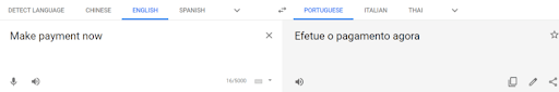
In UX writing, the main goal is to guide the users. And to do this, the message may be long or short depending on the context. Being concise is much more important in this case. If your app caters to multiple languages, you’ll soon find that the original 3-word CTA text in English increases its length when translated to other languages (let’s say Portuguese) anyway.
A quick Google Translate result. Not sure how accurate it is, but you get the idea.
#Myth 3: UX writer only writes
The ideal practice is to integrate UX writers within the design team.
This way, everyone in the team (consisting of researcher, writer, visual designer, and interaction designer for example) is on the same page. Together, they attempt to answer questions such as what the user needs are, what is the ideal flow for a certain task, and how to present the content in that specific context.
UX writing is not simply receiving a design and then add copy at the last minute, barely interacting with design teams.
Crafting the right words to accompany the right designs with the right word choice is as much a design exercise as an illustration or animation.
Patrick Stafford (Senior Digital Writer at MYOB)
[bctt tweet=”#UXwriter Cindy Suryautama Sukiato: The difference between #copywriting and #UXwriting is in the intention. ” username=”brand_minds”]
How UX writing improves the product experience
Now, let’s get practical. There are many ways UX writing can improve your product experience. Since the user accesses your website or downloads your app, they are faced with tasks to accomplish.
To illustrate it better, I’m going to use a project brief I tackled before in an article about the process behind UX writing.
So let’s say we have a gardening app here with these details:
- Users input the plants that they are growing, and the app gives tips from time to time based on that information.
- The target audiences of this app are amateur gardener, first-timer, or people who grow plants as a hobby.
- The app has a fun-loving personality. It gives useful tips, encouragement, and shares the user’s enthusiasm.
Here’s the first screen that the user sees when they open the app.
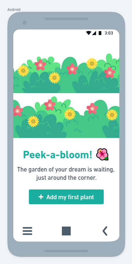
To get gardening tips, the user has to add their plant to the app. This empty state encourages the user to do just that.
You can see UX writing at work here. The headline, body copy, and CTA text are all consistent with the voice and tone of the app.
It also shows how the writing works together with visual (e.g. green colour for headline and button, the use of blooming flowers image) to deliver an overall experience.
And imagine one day we’re going to add a new feature for this app:
- User can now share gardening related stuff in a “forum” and other users can reply to that. Sort of an in-app Quora.
- To take part, the user will need to join the “channels” that they are interested in. For example, there are Sunflower Lovers, Rooftop Garden, and other channels with different topics.
A standard way to introduce this feature would be to describe what it is and what the user needs to do. Perhaps add a CTA button for the user to see what channels are available. Good UX writing aims to do more than that.
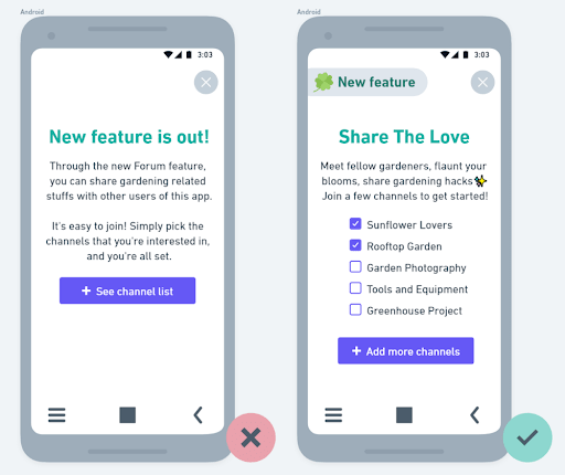
While the way you present the feature is still using a pop-up, the second version shows a good example of how UX writing is more than just words.
First, it introduces the use of a label, in this case saying New feature. In the future, this placement can be re-used for other categories such as Achievement unlocked, Trending Topic, etc. It saves the headline from the need for repeating what this pop-up is about.
And instead of telling users that they can share “gardening related stuff”, the second version gives the ideas of what they can do with this new feature.
Finally, it puts some of the channels upfront for the user to select. By doing this, the user can immediately take action and join the channels that they’re interested in.
The CTA button would then lead to the full list of all channels, including the ones previously picked from the pop-up.
So, this is one way UX writing can give an edge to your product. If you’re up for more, check out these real-world examples of how UX writing can enhance your branding and leave a smile on your user’s face.
Thanks for reading!
Do you have questions regarding UX writing?
Write them in comments and we’ll be happy to answer them!
Join the Conversation
We’d love to hear what you have to say.
Get in touch with us on our LinkedIn Group, Facebook Group or Twitter.