Instagram and Snapchat in the geostickers “battle”
Instagram and SnapChat features go hand-in-hand,with Instagram taking a lot of inspiration from SnapChat and its successful tools.
In March, Instagram has launched geostickers ( a kind of like stickers that represent your location and only work in Instagram’s ephemeral Stories feature), a feature that already had a lot of success on SnapChat.
On SnapChat, geofilters are creative overlays that capture where you are or what you’re up to in a Snap! Create your own, and surprise Snapchatters in the locations you choose. On a business side, Geofilters offer a chance to be seen and sent by Snapchatters at your store, event, or other location. A business can drive awareness and engagement, in one swipe. At the moment, On-Demand Geofilters are available in Australia, Brazil, Canada, Saudi Arabia, UAE, France, the United Kingdom, and most of the USA.
To see the available filters in your area, simply take a picture or record a video and then swipe across the screen. There are two types of On-Demand filters are offered: Personal and Business. In their guidelines, Snapchat explains:
- A Personal Geofilter is one that doesn’t include any branding, business marks/names, or logos, and doesn’t promote a business or a brand. You might submit a Personal Snapchat Geofilter to celebrate a birthday or graduation, for example.
- A Business Geofilter is one that promotes a business or a brand. If you’re creating a Business filter, you must have the necessary rights and permissions to include any business names, marks, logos, or trademarks and you must also supply a business name while purchasing the filter.
More about it you can read here.
And here.
Creating smart, beautiful and interesting geofilters for SnapChat became a business on its own, as companies such as Geofilter Studio, Canva or Pepper Filters prove it.
But how do geofilters work in Instagram? According to TechCrunch, the one thing Instagram’s geostickers and filters do that Snap’s don’t is show the Instagram location page for that place with a tap, though Stories posts won’t show up there, so there’s no privacy issue with that.”All of Instagram’s cloning efforts seem to be paying off. Instagram Stories already has 150 million daily users, more than Snap’s original version of the feature. Instagram Stories is stealing Snapchat usage, which led Snapchat’s user growth to plummet 82 percent in the two quarters after Facebook’s copycat spun up. Now worries about Snap’s growth are sinking into its share price, which slumped 12 percent yesterday and 11 percent today after its 40 percent IPO pop,” wrote TechCrunch in March.
When you click on a geofilter from someone’s Location Story, that geofilter will direct you to Instagram’s Places page, which contains a collection of other users’ posts tagged with the same location. From there, you can watch a long reel of Stories from strangers who have visited and tagged the place you are in.
“If Instagram decides to monetize Location Stories, it will likely look and function similarly to the hashtag feature in Stories Instagram is currently rolling out. Brands will be able to purchase tagged geofilters, featuring their brand name, logo, and location. When Instagrammers click on the filter, they will either be redirected to the Places pages or to the brand’s Instagram page. From either of those pages, Instagrammers can view the business location, get directions, and get familiarized with the brand through the UGC content people posted in Places and the content posted on the brand’s page,” wrote advertisemint.com.
Must Have Gadgets of 2017
A long time ago the phrase “diamonds are a girl’s best friends” became popular and known by everybody. The times changed and today a more suitable and true description, both for men and women, would be “gadgets are a person’s best friends”. In a world dominated by technology, each one of us has a least a gadget that keeps close to them and that would be the first thing they would care about in case of an emergency or a fire.
Therefore, we decided to take a look at the latest inventions in terms of gadget and present you the ones we believe to be the must-haves of 2017. In no particular order….
Dell 2-in-1 Laptops
Dell introduced several convertible laptops this year, and the most notable include its Latitude 7285 and new XPS 13 models. The former is a Surface Pro 4 rival that includes a sharp screen, stylus, and a sturdy keyboard that more closely resembles that of a laptop than most hybrids. The latter is an updated version of Dell’s already great XPS 13 that includes a flexible rotating hinge for use in different positions. Dell also offers the Inspiron 2 in 1, for home and home office. Stay connected with computing that’s easy and inspiring. With the performance of a laptop and versatility of a tablet, you can count on Inspiron to deliver exactly what you need.
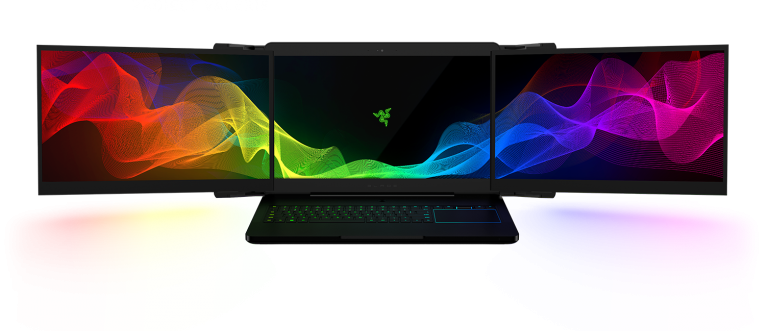
Razer Project Valerie
When you’re using a laptop for doing work, playing video games, and streaming Netflix, one screen isn’t always enough. So why not include three? Razer’s Project Valerie concept does just that by adding two foldable displays that expand out from the primary screen in the center. Each display is 17 inches diagonally and supports 4K resolution, and Razer says they can be used independently or together as one giant display. Project Valerie provides the most expansive viewing experience in a notebook. Powered by an NVIDIA® GeForce® GTX 1080 GPU, and natively supporting NVIDIA Surround View with a whopping resolution of 11520 x 2160, get a wider view of the race track or the battlefield for an unmatched immersive experience.
LG Signature W-Series “Wallpaper” TV
Picture-on-Wall design allows the television to lay virtually flat so it seems blend with the wall and disappear, only possible with the uniquely efficient technology of LG OLED TV. Beautiful on or off, it is the purest form a television can take and the ultimate in minimalism. With the same picture quality as the Wallpaper TV, every OLED in the 2017 lineup delivers perfect black for colors to come alive against. LG OLED pixels are what make it all possible, each turning on and off individually for truly infinite contrast.
Nintendo Switch
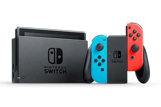
Nintendo Switch is designed to go wherever you do, transforming from home console to portable system in a snap. So you get more time to play the games you love, however you like. The Switch is both mobile and mighty, versatile and idiosyncratic. If the company can provide a steady stream of games over the next year, the Switch may be an exemplar of things to come in gaming. Use two Joy‑Con™ controllers to play face-to-face, or jump online for a 4v4 match. The more, the merrier.
HP Sprout G2 3D-scanning PC
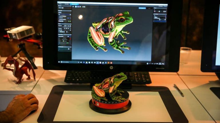
The Sprout G2, with its integrated 3D and 2D scanners, is perfect for product designers, CGI creators and other folks who can benefit from incorporating 3D models into their workflow. It’s also got a stylus-enabled touch mat that acts as a second screen. According to ubergizmo.com, on the hardware side the main improvement is the new 21.3” diagonal Projected Touch Display with full HD resolution on the 20-point capacitive horizontal Touch Mat surface, which is a perfect match for the full HD resolution of the vertical display. The previous HP Sprout Pro model featured a lower 1024×768 resolution, so users were losing the scale when dragging any drawing or graphics from the full HD vertical display onto the horizontal Touch Mat. The 20-point 2.2 mm thick Touch Mat allows two sets of hands to interact with the projected display. More to read here.
Toyota Concept-i

Toyota doesn’t believe the future of the car is only about teaching vehicles to drive for us. While the Concept-i vehicle shown at CES would be capable of driving autonomously, its biggest draw is the artificial intelligence that powers it. Toyota claims the car will be able to learn more about the drivers’ preferences and needs over time, such as suggesting destinations after a driver chats with the vehicle’s virtual assistant, called “Yui.” “Cars are for people who want to go to more places safely and efficiently, and enjoy the thrill of the drive at the same time. We’re excited to introduce you to a vision for the car of the future. Toyota Concept-i and its forward-thinking UX hold a mirror up to a future that is warm, friendly, engaging and, most of all—fun,” it says on the company’s website.
Chrysler Portal concept road warrior
The minivan, although Chrysler is not explicitly calling the Portal a minivan, considers The Verge, it appears to have gotten its name from its wacky door design that opens and closes like an elevator. Chrysler bills the Portal as “next generation family transportation designed by Millennials for Millennials,” which is brand lingo for appealing to people with smartphones and money to burn. The carmaker also bills the Portal as a “third space” where these family-minded Millennials will chose to spend all their time outside their homes and offices. In other words, “an open and serene atmosphere that bridges work and home.”
PowerRay Aquatic Drone
PowerVision’s new PowerRay drone is compatible with an optional FishFinder add-on that uses a sonar system to detect fish up to 131 feet (40 meters) away, lures them with a blue light and send images to the user. It operates in both fresh and salt water and includes a 4K camera that can shoot 12-megapixel stills. This underwater drone can submerge up to 98 feet (30 meters) and records 4K video streamed to your phone, which you use to navigate. Not impressed already? PowerVision will be offering VR goggles that allow you to robot around by tilting your head.
Snapchat Spectacles
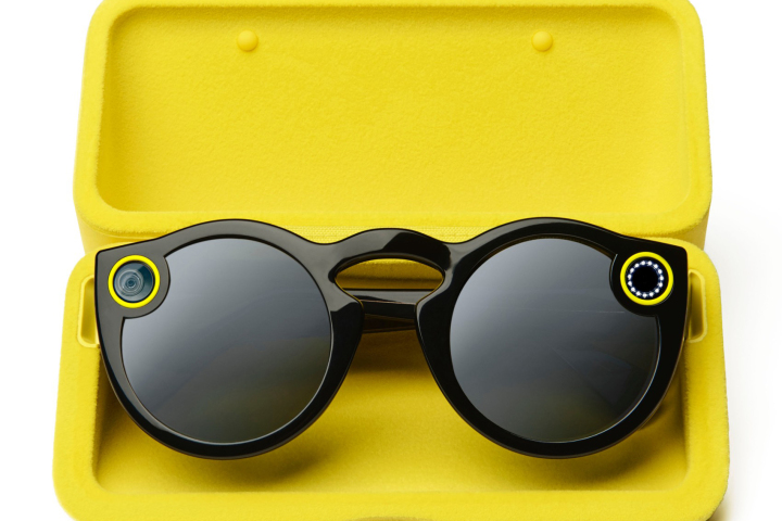
Snapchat parent company Snap Inc. demonstrated its mastery of artificial scarcity when it debuted its Spectacles video-recording glasses late last year. An easy setup process, good-enough video quality and stylish look made Spectacles a hit. But the company’s distribution process—vending machines with limited stock that randomly appeared across the country—made them a phenomenon.
Superpedestrian Copenhagen Wheel
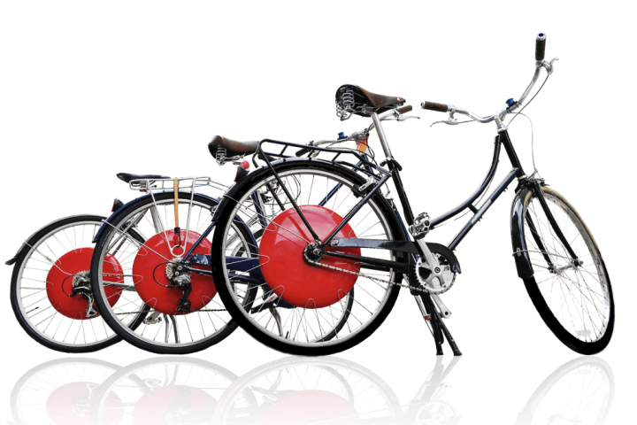
Superpedestrian’s robotic bike wheel augments cyclists’ oomph by powering their ride up to 20 miles per hour for over 30 miles. Though it looks like a simple bike wheel, the Copenhagen packs impressive technology inside. An integrated motor powered by a battery provides the giddyup, a wireless sensor connects to smartphones for data crunching, smart-locking hardware makes sure no one makes off with this $1,499 wheel, and regenerative brakes add to the efficiency.
LeEco smart bikes
Aimed at active users, these road and mountain bikes have GPS navigation and fitness tracking built-in. Though one is a road bike and the other is a mountain bike, both have a 4-inch touchscreen attached to their frames, which run a version of Google’s Android 6.0 Marshmallow operating system that’s specifically tailored for bicycles. “In addition to on-screen directions that feature turn-by-turn navigation for bicyclists, you’ll get a compass, a barometer and a speedometer. The bikes can also play music (both online and off), and you can talk to other LeEco smart bike owners via on-board walkie-talkie technology,” writes www.cnet.com.
Sleep Number 360 smart bed
Designed to keep you and your partner effortlessly comfortable, the Sleep Number 360™ smart bed senses your movements then automatically adjusts firmness, comfort and support to keep you both sleeping blissfully, all night long. Sleep Number made a bed that knows when you’ve got cold feet and turns heat on at the bottom of the bed. You can both adjust to your ideal level of firmness, comfort and support—your Sleep Number® setting, and with Responsive Air™ technology, the bed will start to effortlessly adjust to both of you as you sleep. Moreover, according to the producers, the smart bed can be gently raised on either side to help prevent snoring.
Luke Roberts Smart Light light show
The world’s first smart design lamp gives you the possibility to place light in any direction through simple paint gestures on your phone. Unlike conventional lamps, it is possible to illuminate only certain areas of a room. The lamp can emit direct and indirect light, allowing to create any light setting in your space with just one pendant lamp. In the living room, the light can be directed on the table for dinner with warm white direct light, while the remaining LEDs of the lamp emit a soft, ambient glow to the rest of the room. After dinner it is possible to illuminate, for example, the couch on the other side of the room and simultaneously adjust the color of the indirect light to create the perfect mood for your space.
Smart and Blue’s Hydrao smart shower heads
French company Smart and Blue showed its Hydrao range of shower heads at CES. HYDRAO First lights up the water spray with different colors depending on the amount of water used. Powered by the shower’s natural water-flow, no external power supply is needed. It therefore allows you to instantly control you water consumption and the energy needed to heat it. And you can turn it on without getting out of bed.
20 Things you might not know about Karim Rashid
Karim Rashid is one of the most prolific designers of his generation. Over 3000 designs in production, over 300 awards and working in over 40 countries attest to Karim’s legend of design.
Here are some things you might not know about him:
1.He received a bachelor of Industrial Design in Ottawa, Canada and Postgraduate studies in Italy in 1984. He worked at Rodolfo Bonetto’s studio in Milan for one year then for 7 years at KAN Design in Toronto.
2. His award winning designs include luxury goods for Christofle, Veuve Clicquot, and Alessi, democratic products for Umbra, Bobble, and 3M, furniture for Bonaldo and Vondom, lighting for Artemide and Fontana Arte, high tech products for Asus and Samsung, surface design for Marburg and Abet Laminati, brand identity for Citibank and Sony Ericsson and packaging for Method, Paris Baguette, Kenzo and Hugo Boss.
3. His work is featured in 20 permanent collections and he exhibits art in galleries worldwide. Karim is a perennial winner of the Red Dot award, Chicago Athenaeum Good Design award, I. D. Magazine Annual Design Review, IDSA Industrial Design Excellence award.

4. Karim is a frequent guest lecturer at universities and conferences globally disseminating the importance of design in everyday life. He holds Honorary Doctorates from the OCAD, Toronto and Corcoran College of Art & Design, Washington. Karim has been featured in magazines and books including Time, Vogue, Esquire, GQ, Wallpaper, and countless more.
5. Karim’s latest monograph, XX (Design Media Publishing, 2015), features 400 pages of work selected from the last 20 years. Other books include From The Beginning, an oral history of Karim’s life and inspiration (Forma, 2014); Sketch, featuring 300 hand drawings (Frame Publishing, 2011); KarimSpace, featuring 36 of Karim’s interior designs (Rizzoli, 2009); Design Your Self, Karim’s guide to living (Harper Collins, 2006); Digipop, a digital exploration of computer graphics (Taschen, 2005); Compact Design Portfolio (Chronicle Books 2004); as well as two monographs, titled Evolution (Universe, 2004) and I Want to Change the World (Rizzoli, 2001).
6. In 1992, Rashid started designing for US tableware company Nambé, producing a range of products – clocks, vases and candlesticks – that would help establish his signature look. Alloy and glass are perfect materials to convey Rashid’s organic “blobular” forms, and his work for American lighting brand George Kovacs and German glassware manufacturer Leonardo in the late 1990s again produced modern yet beautiful forms.
7. Rashid’s designs often incorporate a folded-ribbon look (using materials such as fabric, laminate, acrylic and steel) and his computer-generated asterisk, cross and figure-eight motifs, which can be seen on his stools, rugs, kitchen utensils and even Rashid’s own body tattoos.
8. His 1996 ‘Garbino’ rubbish bin for Canadian plastics company Umbra is Rashid’s most well-known design (along with its larger equivalent, the ‘Garbo’). This simple, softly rounded bucket in recycled polypropylene is still one of Umbra’s biggest sellers and is also placed in the permanent collection of the Museum of Modern Art, New York.
9. Once labelled the Poet of Plastic, New York-based interior designer Karim Rashid is known for his curvaceous designs and outspoken persona.
10. The same concept was applied to the affordable and award-winning ‘Oh’ chair, from 1999, which fulfils Rashid’s belief in ‘democratic design’. His skill with polypropylene has also been evident in the highly acclaimed packaging he has designed for global brands like Issey Miyake and Kenzo. More recently, Rashid has also undertaken a number of architecture projects, including the Semiramis Hotel in Athens and the newly opened Switch restaurant in Dubai.
11. In his spare time, Karim’s pluralism flirts with art, fashion, and music and is determined to creatively touch every aspect of our physical and virtual landscape.
12. Him and his team specialize in pattern, print, branding and creative direction. They produce designs that help create or revitalize brands that get noticed through a variety of print and other media. Depending on the nature of the project, graphics is intertwined in product and interior design. They have the ability design a project under one roof which allows for a more seamless process and holistic design.
13. Karim believes that we live in a very special time for humanity, where technology, through the digital revolution, has afforded us new tools to design better space in ways never before conceived.
14. He has an international staff that speaks 12 languages. Presently he is working in 23 countries.
15. To Karim, functionality and minimalism are essential, but, at the same time, he wants to move people and create furniture that make people feel at ease. He calls this approach to design ‘sensual minimalism’.
16. The notion of design being a “high art” has always felt ridiculous to him. “I’ve spent my career trying not to fall into that trap. Early on, companies interested in me were small. They charged more so that they could afford the tooling and the crafting by hand. That’s just what it took to make it. I started to think, Why aren’t bigger companies more interested in design? The designer humanizes our physical and virtual world. Fortunately, things have changed a lot since then. Companies now recognize that design is what differentiates. It’s critical, and demanded,” Karim said for interiordesign.net.
17. He loves doing packaging design, technology, synthetic processes and materials.
18. He used to be obsessed with drawing eyeglasses, shoes, radios and luggage throughout his childhood.
19. He loved Andy Warhol, Rodchenko, Picasso, Calder, Corbusier, Dec Chirac, YSL, Halston, and so many other artists that were pluralists.
20. Karim was also very inspired by his father who was a creative renaissance man, and he saw him create every day. He would design furniture, make dresses for my mother, paint canvases, design sets for television and film, and constantly take us to museums.
12 tips on making the customers buy more in online
The e-commerce industry is probably one of the most competitive at this moment, globally. Therefore, having a successful online shop is not an easy task at all, let alone always growing your business and your customers’ base. There are, although, some steps that, if followed, can really help you achieve your goal.
- Context MattersYour call to action has to fit in with the rest of the copy you have on the page. In this case, put a shopping-cart-related call to action on a page that talks up the product you’ve created or in an article talking about how your product solves a particular problem. It would not go well in an opinion piece about news within your niche.
- Keep it Simple
Your consumer need to find the right information fast. Don’t overcrowd the message by having a heavy environment or many information popping out. It’s important to make the consumer journey as fast and easy as possible. Nothing forced, just flowing. Guide him without letting him feel he is guided. The body of your copy is the place to talk up your products or services. The call to action is what convinces consumers to start shopping.
- Product reviews
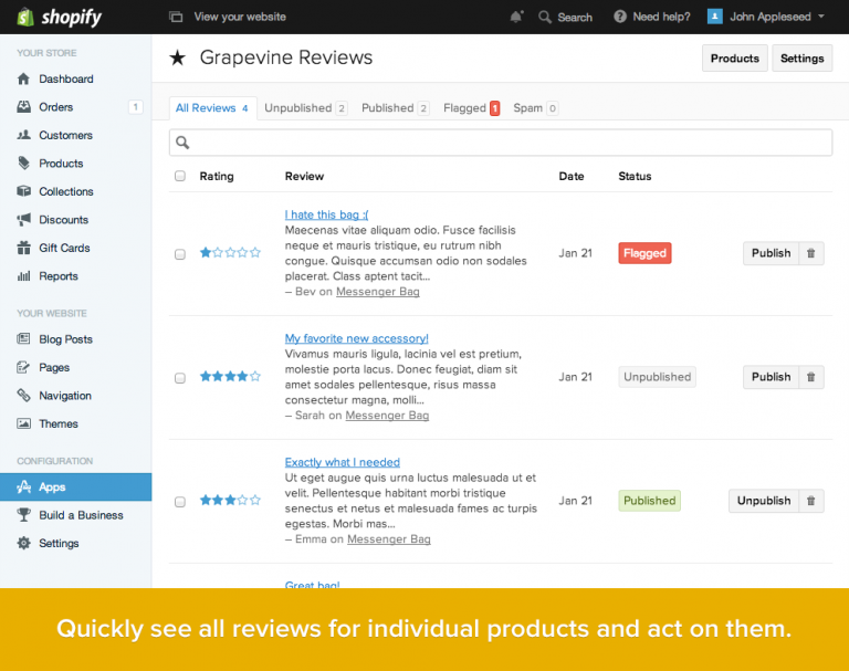
Sometimes the best advocate for your online shop and product are your customers. Your product descriptions – something we’ll cover late – can only do so much to convince folks to part with their money. Allowing your customers to review products they’ve bought lets them express how they felt about the overall experience and the product itself. Plus it’s the perfect way to get your products validated by a third party. According to Reevoo, quoted by Paymill.com, “reviews produce an average 18% increase in sales, and having 50 or more reviews on a product can increase its conversion by 4.6%”, while MarketingSherpa considers that 58% of consumers prefer sites that offer reviews.
- Placement Matters
Most of the time, a call to action works best when placed at the end of your copy or content. If your particular business makes use of the long-form sales page, putting the call to action higher up is a good idea. You can highlight the benefits of your products and encourage people to buy.
- Make sure you use quality images
Since the technology has evolved so far and one can take a great quality picture, at a high resolution, even with the smartphone there are no more excuses for not using the best pictures possible for your products. You can not only use images to highlight your product’s qualities, but also show it in use to help visitors visualize how the product can be used everyday.
- Great product descriptions
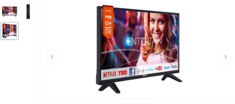
Making it easy for the customers to find the right information and teaching them about the product they are interested in. The writing should be focused on you target and its needs, therefore the tone of voice should be adapted to that. It’s important to focus on the product’s benefits and to keep the language simple, avoiding as much as possible the jargon and write short sentences to help the readability.
- Build Excitement
You need to build up the product or line of products in customers’ minds before asking them to buy. This way, there won’t be any doubt about if they want to take the action you’re calling on them to take. Talk about or show how beneficial what you’re selling can be in the buyer’s life.
- Be Active, Not Passive
“It would be nice if you bought my stuff” is not the same as “Click here to start shopping.” Passive implies that you aren’t sure if you want them to do the thing you’re asking them to do. Active voice removes all doubt about your expectations, shows confidence in your products and brands, which it will bring confidence for the customers as well.
9. Try and have pages as clickable as possible
It helps if you make your call to action an actual clickable link — preferably to your shopping cart (which can say something like “Cart empty! Start shopping here”). This saves the viewer the time of searching for the thing that helps them do what you want them to do. As said earlier, making things easier and comfortable for the shopper only helps your business and your sales.
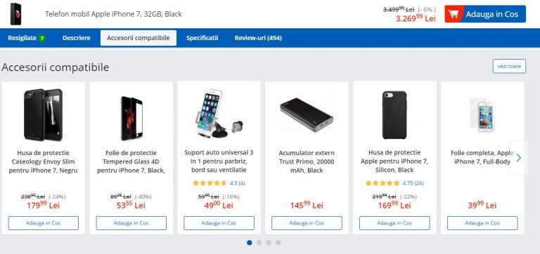
- Show related products that would look great next to the product they already have in the cart or that would fit perfectly. For example for a photo camera a memory card or different lenses. People tend to buy more this way. It’s an opportunity to increase revenue because it shows items visitors may not have otherwise been looking for and it takes them to pages they may haven’t been interested in entering.
- Easy and safe payment
One of the biggest concerns that people address when it comes to online shopping is the safety of their payment. Make sure you have a trustful provider and that you make the process as easy as possible. Offer them different payment methods, don’t force them to sign up for different offers or newsletters, don’t ask them a bunch of unnecessary information, make sure the checkout page matches the rest of the store. Those would be just some easy, but really important pieces of advice.
- Test, Change, Test Again
Having an online store means constant work of improvement. Even if you have constant growth and awards won, there is always something you can improve. Therefore, test and keep on always testing your website. After all, the final goal is to always keep the costumer happy and wanting to come back and bring more friends along.
Best packaging ideas for 2017
In the very competitive and full of inspiration and imagination year such as 2017, a good product is not enough for it to become a brand and capture the consumer’s attention. Let alone make him/ her choose it from the numerous similar products on the shelf and lead to a future buy. Therefore, a great packaging design, in sink with the product’s qualities, characteristics and what it stands for, will mark the path to a successful rise and growth of a brand.
Here are some of this year’s main packaging design trends and ideas:
1. Back to basics. Simple, bold and clear
source: skinn.be
This year, the trend is better articulated and more compelling to the customer. Minimizing the elements used in a package design can elevate a product… as long as it gets the point across. In our fast-paced world, shoppers don’t always have the time to study each and every product detail. Sticking to the essentials and making sure the buyer will make a more informed decision, a clean-cut design can convey information and make a product shine using simplicity.
According to thedieline.com, the designers understood the purpose of the object and the thought process of their audience. In service of this, they simplified the message and stated it clearly and boldly across the face of the packaging. These designs are text-based and say what they are in no uncertain terms. They realize the value of a simple message in today’s crowded world. The simplicity does not come off as lazy or incomplete but refreshing and honest. This is the manifestation of the idea: clarify not simplify. These designs identified exactly what the customer was searching for and expressed it simply. It comes off as powerful and trustworthy.
source: tapped
2. Putting focus on the custom lettering
Almost every designer loves to get crafty and create some of their artwork by hand. According to Martin Lupus of 99designs.com this thing happens in order to get the organic effect: fluid imperfections—like irregular lines or natural texture fills— that can make a product stand out through warmth and set it apart from digital designs. “This warmth can create an emotional tie to the product, making it feel handmade and wholesome, or communicating a feeling of nostalgia. Either way, for 2017, we are seeing a massive comeback of hand-lettering,” added Lupus.
source: sweetyland
3. Letting geometry rule!
source: thedieline
Hand in hand with the previous trend, this theme is centered around expressing simplicity, approachability, and honesty through patterns and shapes. Circles, triangles, and squares are, as the specialists consider, an attempt to treat the mindset of a weary, overwhelmed consumer. Particularly in industries with over-the-top design, these reduced approaches standout. Familiar shapes, colors, and patterns communicate an awareness of the world and a sensitivity to the consumer.
- Old school with a twist
The past is haunting us, but in a good way, through a “idealization of the past—a longing for simpler times when things were cared for, made by hand, and detail-oriented”, as Grant Wenzlau from dieline.com would say. But these designs are not simply regurgitating old forms and techniques, they are modernizing them and combining them in new ways. “This new take on what is old is refreshing because it selects the best parts of different periods of our history and juxtaposes them. These designers realize the increasing rareness of endangered techniques like calligraphy, letterpress, and foiling. These artisanal practices grow more and more desired each year. In the mind of the consumer, they are increasingly novel and related to greater value. But far from merely being historical, these techniques are being re-imagined in the context of mid-century layouts and applied to a 21st Century, cutting-edge materials”.
source: ACH Vegan Chocolate
source: cocktail kit
Moreover, vintage package design brings back memories for people who lived through the original era and satisfies the curiosity of younger generations eager to explore the past. The key to going vintage is to find a balance.
5. Making the color a focus and priority
Colors evoke emotions and affect purchasing decisions. Because of this, color has always been one of the most important choices in packaging design, presenting in new, exciting ways. Bright colors and vibrant associations are beginning to make a scene on store shelves. More than that the colors and their special use are able to differentiate the packaging and the product at the shelf, making it to stand out and attract the consumer that will always choose exciting over common and boring. Also, it is proven that the consumer will always remember a product that is interesting and has the wow visual factor.
source: Pyramida
source: Resonance
6. Be playful and multi-functional!
In each of us lays a child and we love to be given the opportunity to loose ourselves from time to time. So does the consumer. He appreciates a good, interesting packaging that can be joyful, playful and multi-functional.
source: Monstea
7. Repeating a pattern
source: Helmes Workshop
We learn and remember through patterns, as our brain is built that way. Using well-chosen and beautiful patterns can also elevate a package design from ordinary to ethereal. Although the idea of repetitive shapes might seem simple, the technique can be dynamic and compelling when used correctly. Moreover, as it happens in writing a book or a play or a song, repeating a visual motif that captures the essence of the brand sends a strong message. Whether the pattern is bold or playful, patterning the package can create a strong identity that customers will always remember.
8. Storytelling & narrative
source: Smith & We All Need Works
People love stories and, as previously said, having a story behind everything one does it’s always a plus, giving it authenticity and creativity, at the same time. We seek out and cherish the stories that feel closest to our hearts, therefore the packaging design are starting also to incorporate narrative illustrations, trying to get closer to the consumer’s empathies and emotions. The place where the real sale and conviction start.
9. Putting it in the mail
source: Luxembourg
Internationally, there’s a strong comeback for the print and its values, for going to back to the roots, the life before the online. Coffee shops that are inviting their costumers to stop using the wifi and talk to each other, online magazines that are starting to get their first printed versions, people choosing books over kindles, etc. With faster, more efficient ways to communicate, the joy of receiving a letter via the post, in the real mail, not online, has started to disappear over the years. But there is a new trend that will take people back to that feeling. According to the specialists from 99designs.com, the packaging design is here to save the day with an emerging postal trend.
10. Going eco-friendly
The years to come will be more and more about sustainability. According to packaginginnovation.com, the new trends are about using green padding materials, with biodegradable bubble wrap and recycled paper being perfect eco-friendly alternatives. “One of the leaders in sustainable design, method sells bottles made with recycled ocean plastic. From using more renewable resources to keeping materials recyclable, more consumer brands are integrating eco-friendly design into their business. This is a trend that we hope to see grow with each year because it benefits everyone,” also added and concluded Martin Lupus.
source: Grow With Me