Acquire More Email Subscribers: 11 Optimization Tips For Exit-Intent Popups
Do you want to acquire more email subscribers?
This article will show you how to optimize your exit-intent popups to increase your email subscribers.
Daniel Doan is a growth marketing consultant and digital strategist who helps eCommerce and tech companies scale with growth strategy. For the past eight years he has been working with B2C and B2B companies doing digital marketing and growth hacking. As all growth hacking marketers know, A/B testing is the secret for discovering what works and what doesn’t. His record is 260 A/B tests in a single year! It takes a lot of patience, creativity and perseverance to get to this whooping number.
As a result of his extended testing, he crystallised the following optimization tips that helped him acquire over 90.000 email subscribers with an average conversion rate of 20-25% in B2C and 3-5% in B2B.
Here are Daniel Doan’s 11 exit-intent popup optimization tips to help you boost your email subscribers:
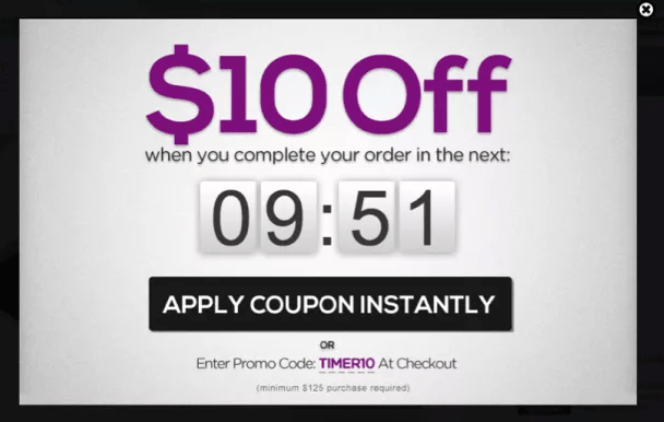
1. Pair it with a 10-second timer
Exit-intent logic is a bit fuzzy on mobile so pairing it with a guaranteed timer works wonders.
Daniel Doan
This tip is an illustration of urgency. Together with scarcity, urgency is one of the human behaviours that eCommerce sites leverage to perfection to influence their visitors into taking particular actions: subscribe to newsletter, make purchases etc. And it works because we don’t like to lose, and a time-bound offer makes us push the Yes button.
To prevent your countdown from restarting as your viewer refreshes the page, you can add a code that stores the timer value in a cookie, so it never restarts on a page refresh.
source: Maxtraffic.com
2. Experiment with adding humour
A little goes a long way, especially if it’s an in-joke amongst your target audience.
Daniel Doan
Make them laugh or at least smile. Humour is a powerful tool and a differentiation amongst your competition. It means you are showing respect to your subscribers by steering away from being boring.
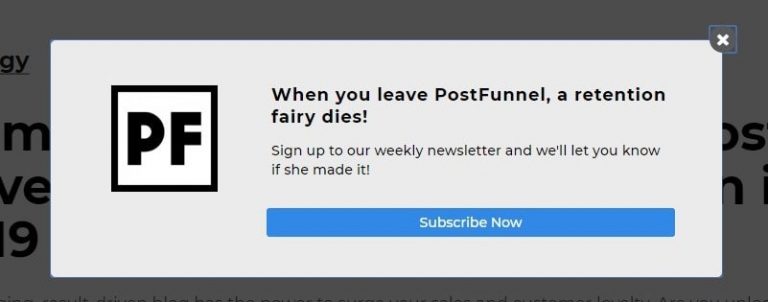
You will receive additional points if you make the effort of inserting a joke targeted at your specific audience. It shows you have taken the time to get to know your audience, jokes and all which make you one of the guys (or gals :).
3. Add reassurance that their email is safe and won’t get spammed or sold
This tip is about earning trust with your subscribers. By letting them know you are aware of their fears and showing empathy, you influence them to let their guard down and trust you with their email address. Considering the scandals around personal data that sent the internet into turmoil in 2018, it’s understandable.
source: flaticon.com
Also add a small lock icon near the email field. It works pretty well to subconsciously increase trust, making the user feel more secure about making the decision to drop in their email.
Daniel Doan
4. Experiment with Sans Serif fonts
Removing the serif leads to better digital readability and higher conversions if it matches the aesthetic of the brand.
Daniel Doan
Sans Serif fonts are simple and convey modernity and simplicity. According to this source, web designers have turned to sans serif fonts like Roboto, Mina, Opens Sans, Lato etc because they are more suitable to display content on PC screens.
5. Change text on submit buttons to be in all lowercase
I was surprised at this one, but it might be because it’s a pattern interrupt.
Daniel Doan
When they receive the same kind of information, whether is the same colour, the same shape, music or taste, people get accustomed to it and soon they won’t pay attention to it. It’s just something in the background noise.
Exit-intent popups rely on visual impact so when your visitors have seen 20 pop ups with text in uppercase in the last four weeks, if your popup uses text in lowercase, it will get their attention because it’s different.
6. Framing the value of the header as a question
Leading with a question-based header seems to convert a lot better.
Daniel Doan

The secret behind a successful question-based header in your CTA is personalization.
You need to do your homework and know your customer like the back of your hand: pain points, problems they need to solve, subjects they need help with, areas they want to develop, skills they want to grow etc.
Now formulate your subscriber’s need or pain point as a question which has only one answer: Yes.

source: crazyegg.com
In order to achieve that, focus on the benefit, gain or any other value that your subscriber will receive by opting-in to your newsletter.
Want to become a better salesman?
Or
Do you want to sell more?
Here is a great source to learn more about asking the right questions.
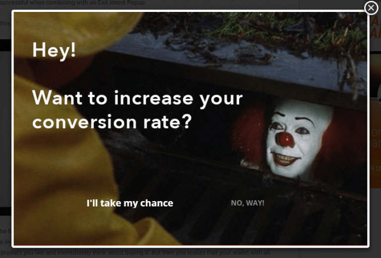
7. Adding a no option that makes them feel a bit guilty if they click it
This may fall under a dark pattern, so I’d tread lightly with this one…but it does work!
Daniel Doan
Examples:
No, I’d rather miss out on 10% off.
No, thanks, I’d rather stay a mediocre marketer.
No, thanks, I don’t want to delight my customers.
No, thanks, I don’t want to help my customers sell more.
8. Lead with pure value and nothing less
Always have the button speak clearly to the value that it’s providing. NEVER have a generic “submit” button.
Daniel Doan
If your website visitor doesn’t believe they will receive value in exchange for their email address, they will not subscribe.
9. Add a bit of blue trim
For some reason blue seems to work really well in terms of boosting conversions ..it might be that blue is a trust colour.
Daniel Doan
10. Have a human-element in the popups
I have my face on my popups, but if you can creatively and legally use a notable celebrity of some kind, this works wonders for conversions.
Daniel Doan
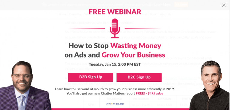
source: convinceandconvert.com
11. Green is amazing for conversions
Similar to blue, experiment with splashes of green in a creative way to add excitement – green is great for the CTA button, or the trim immediately around it.
Daniel Doan
Join the Conversation
We’d love to hear what you have to say.
Get in touch with us on Facebook Group and Twitter.
